Hilary Clinton has joined Donald Trump in vowing to oppose TPP. US House Speaker Paul Ryan has also conceded he wouldn’t have the votes to pass TPP in a Lame Duck congressional session, effectively sinking Obama’s last chance to pass it before leaving office.
That all means the TPP is functionally dead. Without US ratification, the agreement can’t come into force.
So, why did it die?
There’s a theory of political institutions called Veto Players that can help explain this. Start with two basic ideas:
- Each big country, or group of small countries, has a veto over the final agreement. And the US functionally has two veto players – the President and Congress – because of its treaty ratification rules.
- Countries veto agreements that drive the world further away from their desired outcome.
With those basics in mind, we can build a little model of TPP.
Let’s simplify the issues under negotiation to two core dimensions, and start building a chart:
- How much protection is there for local markets in goods, via tariffs, minimum labour standards, and so on. This is “Goods protection” in the chart
- How much protection is there for investors and exporters going into overseas markets, via patents / copyrights / ISDS rules, and the like. This is “IP / investment protection” in the chart.
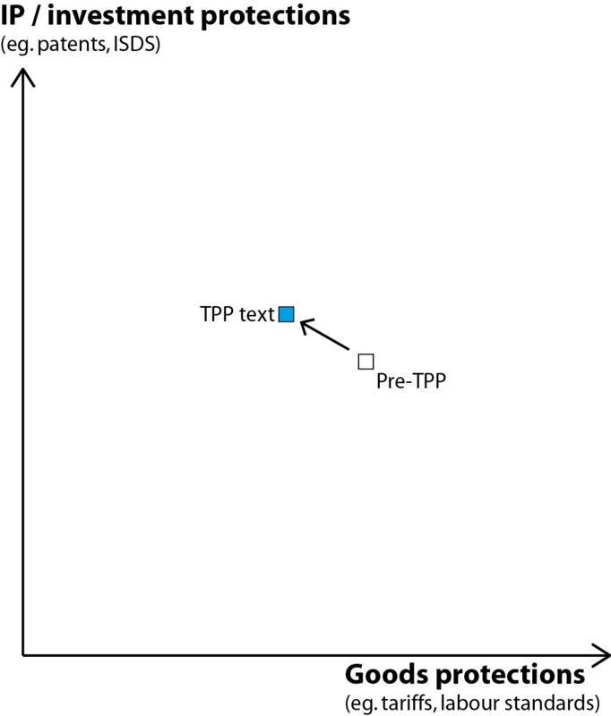
The TPP clearly dropped some goods protections, as you see illustrated above. Im my read it also increased IP / investment protections overall, because the investor-friendly ISDS and copyright changes outweighed the consumer-friendly changes to drug patents.
But how does that eventual proposal square up with what the countries involved in the TPP negotiations actually wanted?
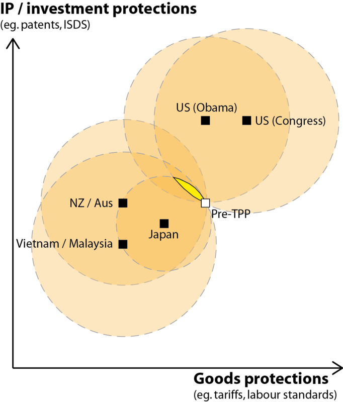
We can hazard some guesses at countries’ ideal points, too, based on their public statements and their history. Let’s just think about a few of the core players:
- The Obama administration’s main concern was extending IP and investor protections for large American firms. They were less worried about goods protection, one way of the other.
- The US Congress was more seized with “protecting American jobs” from the effects of the last decade or more of outsourcing. That means, in their ideal world, **more** protection of American domestic goods manufacturers, to prevent a recurrence of the US job losses that followed NAFTA, as well as protecting US investors offshore.
(Yes, this assessment runs counter to the Congressional rhetoric on free trade. But American hypocrisy on trade matters is nothing new.)
- Japan wanted some tariff reductions to allow its goods into the US, but not wholesale tariff reductions that exposed their agriculture sector to too much forwign competition. They also seemed lukewarm on which way to go on IP protections.
- New Zealand, Australia, and some others can go one way or the other on IP / investor rights – trading off better biologic access against allowing ISDS, for example – so long as there were big cuts in goods tariffs.
- Vietnam, Malaysia, and some other developing economies also want the tariff reductions to allow better access to big markets, but they’re more opposed to the IP / ISDS elements of the deal, fearing they’d lose some of the ability to legislate in the public interest.

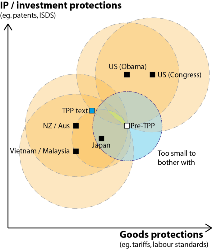
These preferred outcomes are included in the second chart above. The precise placement of the dots isn’t super-important, what matters is there’s a real diversity of opinion.
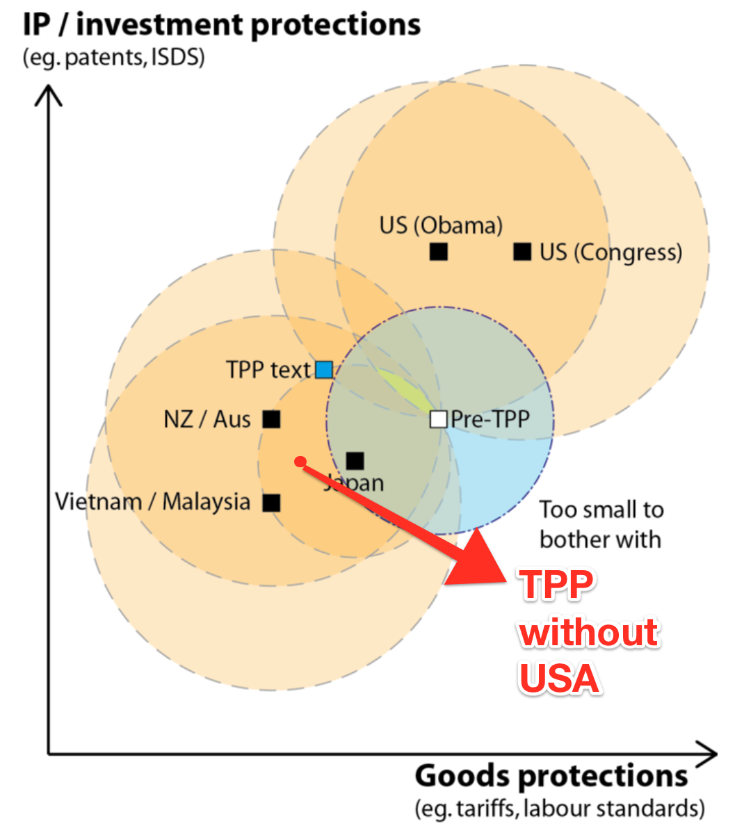
In this situation, with lots of veto players and diverse national policy goals, there’s often very limited room to find an agreement that makes nobody wore off.
In fact, we can illustrate how little room there is by drawing some “indifference circles.” The middle of each of these circles is country’s preferred outcome, because that ideal point is what you’re trying to get closer to. The edge of every country’s circle passes through the status quo, because that status quo is what we’re measuring improvement – from each country’s unique perspective – against.
On the chart, orange represents improvement for one country, and yellow is the part of the chart where everyone is better off.
As we’d suspect, the yellow sliver is tiny and represents modest policy change from what we already have. The TPP would have to be in this yellow sliver to get each player to sign it off on policy grounds.
But there’s a wrinkle here – the trade negotiators themselves don’t always share their country’s policy preferences. (It’s a version of a “principal – agent problem”.)
In this case the trade negotiation folk had an extra consideration. They had pinned their hopes on TPP to be a major breakthrough in the stalling progress of global free trade. That means the deal had to “make a splash,” “be big and bold,” “be a game-changer,” or similar.
We can show that on the chart with a final circle, showing TPP policy-mixes that too close to the status quo to be worth the risks and costs of bothering with, from the trade negotiatiors’ position.
The uncomfortable reality of this situation was that the players could have either an agreement where everyone was actually better off, or it could have a deal that looked big and grand, but not both. They chose an agreement that looked big and grand, probably knowing they’d have an uphill battle with the US population and politicians, with the unhappy result that all their work ultimately has come to naught.