Hard News: Reviews: #NZGT and the Herald
95 Responses
First ←Older Page 1 2 3 4 Newer→ Last
-
Robyn Gallagher, in reply to
I happened to be in the Octagon on the day, and saw the limo pull up outside the theatre.
Being NZ's Got Talent, the "limo" is actually a Toyota Yaris! (Oh crap, the sponsorship has stuck in my brain...)
-
James Butler, in reply to
In the old days in Herald features there was a sub – now, mercifully, not among us – who had to be physically restrained from changing “missed by a mile” to “missed by 1.6km”. I am not making this up.
I’d like to see said sub dealing to the word “milestone”.
ETA: Yes I know, it's "10.2 kilometre kilograms" before anyone gets smart.
-
Really? Geez, if you stretch it it might get almost as long as my Suzuki Gazelle, and that's a long way from limodom.
-
Martin Lindberg, in reply to
Why? Restructing is a perfectly cromulent word.
-
The format is codified in a so-called ‘production bible’,
How apt! How to codify bullshit and flog it to as large a number of people as possible. While patting yourself on the back, and telling yourself you deserve all the moola. Bet this "sheew" is a damn sight more entertaining tho, I dont have a gogglebox
OK, I confess, I know what a PB is. Run across 'em before in my lifetime. -
Kumara Republic, in reply to
Fair point.
The best error I've seen in the Herald (probably computer generated) is the conversion of the abbreviation STG into a pound sign, as in this article:
What next, a Scunthorpe or Tyson Homosexual episode?
-
The Herald online the font is annoying – the previous online presence was more to my preference.
The Poll of the day – today I found interesting – it could become a drag.
The format appears to lend itself to sensation rather than news and editorial content,
“Cross dresser robs Good Samaritans” - I thought they could have gone to the effort of fining out what he was wearing – at least.
The Bob Jones piece he has written many times before – that it has over 50 comments is surprising as it is retread rather than a “hot issue” of the day.
-
1. I HATE the new Herald online format. Highly irritating font, and not comfortable to read.
2. I went to a live taping of an audition show for the previous incarnation of NZGT. And yes it's hokey - all the shots that are taken as stoc audience response. But I'm a sucker for these kinds of shows. I agree with Robyn that Idol was never going to work here. What serious musician of any ilk was ever going to go on a show like that? It had shit prizes and stunk just a little too much of over manufactured hype for it to take. -
Sacha, in reply to
Highly irritating font, and not comfortable to read.
Really? Does it get any better if you make it bigger?
-
John Armstrong, in reply to
Highly irritating font
In terms of the headlines, I agree. All the curvey parts of the font (I'm sure there must be a fancy word for them) look pixelated. Makes me think that the page is always only partially loaded.
-
Russell Brown, in reply to
In terms of the headlines, I agree. All the curvey parts of the font (I’m sure there must be a fancy word for them) look pixelated. Makes me think that the page is always only partially loaded.
It's a WOFF web font that looks great if your browser can display it properly, and nasty if it can't. It should be fine in recent versions of Chrome and Firefox, but if you're an Internet Explorer user you need to get to IE9 or better.
Public Address uses a Typekit web font which creates similar issues for some people. If our text looks bitty, you can try disabling the font by clicking "disable" at the bottom right of every page.
-
Ian Dalziel, in reply to
The Beginthewordning...*
Restructing is a perfectly cromulent word.
Oh, but I see they (The Herald on-line) don't bother 'restructing' american spellings, so sombre stays as somber nowadays on overseas feeds, saves time and money...
Damn these neologisms, when will it all settle down to Galactic Standard?
- admittedly Fairfax does a similar sort of uncaring thing, as they seem to run the original unsubbed (ie older) text of stories on-line, which leads to divergence between print edition and on-line versions.
Personally that seems counterintuitive to the alleged immediacy of web news, and leaves the least reliable version of a story as the only one available for on-line searching, reinforcing an error perhaps?
Sure post-subbing the copy may have been cut to fit a space but it has at least been filtered for obvious (and not so obvious) errors, grammar and correctness, subs check things (apparently, a recent revelation to American journalists)- this way lies confusion at best, and litigation at worst, perhaps modern paper publishers can live with that...the curvey parts of the font (I’m sure there must be a fancy word for them)
Meet: shoulder, bowl, swash, tail and terminal
*Dingbat speak -
Ian Dalziel, in reply to
It’s a WOFF web font
The Herald (on-line) body copy comes up as Optima for me,
and the headlines look like an Egyptienne derivative...
(through Chrome) -
I am using Chrome and it all looks awful. Is it my screen? I must try it on the macbook.
-
Rich of Observationz, in reply to
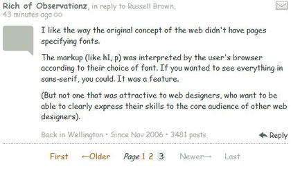
I like the way the original concept of the web didn't have pages specifying fonts.
The markup (like h1, p) was interpreted by the user's browser according to their choice of font. If you wanted to see everything in sans-serif, you could. It was a feature.
(But not one that was attractive to web designers, who want to be able to clearly express their skills to the core audience of other web designers).
-
Martin Lindberg, in reply to
-
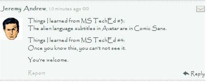
Things I learned from MS TechEd #3:
The alien language subtitles in Avatar are in Comic Sans.Things I learned from MS TechEd #4:
Once you know this, you can't not see it.You're welcome.
-
Martin Lindberg, in reply to
-
Can someone explain the (irrational?) hatred for comic sans to me?
Is it from over-use or use in inappropriate settings?
Is it a snobbish “I wouldn’t be seen dead using it” or is there something fundamentally “wrong” about it that makes it a poor font in ways that are not wrong with gothic, times new roman, ariel or a zillion other common fonts?
I dont love it, and but I cant see why so many hate it so much? It’s just another font to me.
-
Feel like I need somewhere to mourn the tactility of broadsheet. You can no longer open the opinion pages and have two (or three) columns a cartoon and the letters sitting there. It doesn't occupy a table, you need more pages for the fish and chips, there is less information spread out in front of you.
I actually feel physically repulsed by the new edition. It's going to take a lot of adjustment or a perhaps new tablet device. It's still ok on the smart phone!
I feel like I need a place to mourn Granny. Also to add her to the Auckland Savings Bank as a long running civic institution to be proud of that we used to know.
Still I should probably give the new slag of a paper a chance. But really a city without a broadsheet?? Even Hamilton's got a broadsheet right?
I had another crack about thinking it was a copy of the Harbour News, but was set straight when I realised it didn't have that insightful editorial from Pat Booth. Decided that was a step too far.
Guess everyone here is using some nifty device though and I'm the only old fogie yearning for the paper- especially at the weekend it is going to suck.
-
plaintive pleas unheard...
The Herald on-line (and probably off-line, too) reports that Chchch people with legitimate grievances about their treatment must have started legal proceedings against that paragon of compassion......Gerry Brownlee has reportedly hit back at criticism from quake-affected Christchurch residents by calling the complainants moaners who have time to "buggerise around on Facebook all day".
Being charitable I believe they just simply meant "complainers", and I haven't quite got to the bottom of how despicable I think Gerry Brownlee is...
-
Martin Lindberg, in reply to
Can someone explain the (irrational?) hatred for comic sans to me?
This explains it fairly well.
-
http://www.nzherald.co.nz/nz/news/article.cfm?c_id=1&objectid=10833532
How does National get to run these numbers and how does it make the lead on the Herald website??
$78 billion if everyone on the benefit at a low point in the economic cycle is always on the benefit.
Also on the trend in poll results Labour and the Greens will hold 137% of the seats in 12 years time.
X X
___ -
Jeremy Andrew, in reply to
Trust Microsoft to teach you wrong. I'm pretty sure that was Comic Sans' evil cousin Papyrus.
That's what I get for taking the word of a NY Times infographicist! He gained my trust with his hipster glasses and same first name as me...
-
Matthew Poole, in reply to
The paper’s usage is correct. Titles are capitalized, job descriptions are not.
Then what does "former wing commander Logan Cudby" mean? Wing Commander is a rank, and there are references to others of that rank with appropriate capitalisation. The article's internal consistency is a mess.
They also failed to adhere to the correct form by not capitalising Air Force once, except when they correctly used Royal New Zealand Air Force. Hell, the article even says "Australian defence force". The body is called "Australian Defence Force", ffs. Similarly there are references to "defence force" which I take to mean NZDF, and there's talk of "defence websites" which should, I believe, be "Defence websites" since I've assumed it's meaning websites operated by parts of NZDF.


Post your response…
This topic is closed.