Hard News: Not yet standing upright
316 Responses
First ←Older Page 1 2 3 4 5 … 13 Newer→ Last
-
Matthew Poole, in reply to
Are you against voting?
Vote fnord Hypnoflag fnord!
-
That Hundertwasser's flag wasn't included - just an updated version from someone else - shows how wrong the whole exercise is. I didn't realise how famous he was until I went to Germany - I even managed to buy a Hundertwasser Advent Calendar.
The story of an immigrant bonding with our young country and designing a flag based on indigenous art forms provides a story that melds with our nation's history.
That Otis Frizzell's flag design didn't make the top 4, yet a version that John Key likes being included twice with a minor colour change, shows how captured this whole process was from the beginning.
And if you were going to spend $26 million on the exercise, why on earth would you use cheap, nasty and ubiquitous display equipment like pull-up posters as the backdrop to your presentation, rather than spending a couple of thousand dollars more on something more impressive like lycra banners? Why didn't they actually print the flags rather than showing an AV representation from them? The "panel" must be flying first-class and staying in 5-star hotels, because the presentation equipment they're using must only be costing 0.01% of the budget. -
Couldn't agree more, Russell. I championed the change only to be bitterly disappointed in the choice of the final four.
As much as it pains me, right now, I am posed to ignore the first referendum and vote to keep the current flag.
-
As well as going against the design principles in that video, it seems the panel didn't even heed their own advice.
"A great flag should be distinctive and so simple it can be drawn by a child from memory."
Simple is a kid drawing green, white and orange stripes and making the Irish flag. Those complicated fern designs are not simple.
This whole exercise has been really depressing. This is exactly what happens when a design competition is judged by a panel of people with zero design knowledge or experience.
-
Interesting point in the "how to design a flag video": No Language allowed. But it then goes on to unpick the symbolism of some of the most distinct flags.
More importantly, by focusing on the fern, the committee have completely ignored the only "don't do" instruction in the whole video, and used the fern as such a universal trope for NZ that it effectively _is_ a linguistic device.
And then they ignored all the positive instructions: rule of thirds and how to balance symmetry and asymmetry for beginners, AND how to break the rules if you're an expert. Everything.
-
Amanda Wreckonwith, in reply to
Otis Frizzell’s not being in the final 4 is a mystery to me.
Too much green on it.
Too ‘environmental’ (or too islamic?) for the PM. -
Ian Dalziel, in reply to
-
Katharine Moody, in reply to
That Hundertwasser’s flag wasn’t included
See the Note here on that;
https://www.govt.nz/browse/engaging-with-government/the-nz-flag-your-chance-to-decide/gallery/
Surely a profressional panel/process would have sought copyright permission from whomever the owner of it is - given the number of NZers who were already keen/familiar with the design?
-
That Hundertwasser’s flag wasn’t included
"Modern Hundertwasser" flag (a facsimile of Hundertwasser's famous flag, submitted by Thomas Cottle) was withdrawn from consideration because the Hundertwasser Foundation complained that it breached copyright.
It's understandable at some level, but rather surprising and definitely disappointing they did that without also re-submitting it themselves.
-
-
we could have punched above our weight and all those other myths about us kiwis with the flag options.... instead we've shown how truely average we can be, ignore the inspired and representative and opt for a cheap logo instead
at least the damn thing will be worth billions once picked so we can drunk our pain away
-
After all this contemplation, we seemed to have wound up with what you’d get if you hadn’t really thought about it.
This.
This is exactly the problem. These are the designs you'd get in the first two minutes of a discussion on a new flag. They are the most obvious and least thought out.
I dislike all the silver fern ones. I think they immediately fail the simplicity goals of a flag - especially the "could a child draw it" test.
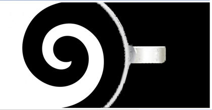
And the koru we've been presented with isn't an appealing koru at all. It's thin and inconsistent. The Tino Rangatiratanga koru design is much bolder and more appealing, as is Andrew Baker's design that you've highlighted.
-
James Littlewood*, in reply to
Yeah, you'd think.
I notice the panel's letter describes not so much a consideration of aesthetics and culture as "detailed due diligence including robust intellectual property checks."
Guess if they'd have wanted it, they'd have sought the rights to it. Problem solved.
Still have to hand it to the Gvt: they structured the process cleverly so that the most important bit - creating the new design - took place while the least number of people were paying attention.
-
Katharine Moody, in reply to
-
I can't help but think that the flag shortlist has shades of the Wellywood sign controversy, but on a nationwide scale (and with foreign coverage tacitly smirking at us). And if the whole thing flops and becomes a laughing stock, whatever's chosen will likely be associated with Brand Key rather than Brand New Zealand. Don't be too surprised if it starts appearing on underwear, bikinis, or toilet paper.
-
Dylan Reeve, in reply to
No mention of the fact two of the final four are in fact copyrighted. I’m sure the owner will sell them to us, but the question is why didn’t the panel even pick that up???
They're all copyrighted. You make something, you get the copyright. It's just that Kyle Lockwood already commercially exploits the copyright in his designs.
However from memory (can't find them online anymore) the terms of the submission process declared that you would gift the rights to your design to the government if it was selected to be the flag or something.
-
Kumara Republic, in reply to
The Tino Rangatiratanga koru design is much bolder and more appealing
Too bold for some narrow-minded people. For them it's a symbol of separatism.
-
Katharine Moody, in reply to
Still have to hand it to the Gvt: they structured the process cleverly so that the most important bit – creating the new design – took place while the least number of people were paying attention.
How true. I keep thinking what an opportunity lost (or should I say ’cost' – given the $26m price tag). For me I’d like to have seen a shortlist of emblems that have meaning to NZers first (e.g., whale tail, fish hook, silver fern, southern cross, Union Jack, koru, etc.) and then set up equally as many professional design teams – each working with one of the shortlisted emblems in order to produce a short-short list.
-
Kumara Republic, in reply to
They’re all copyrighted. You make something, you get the copyright. It’s just that Kyle Lockwood already commercially exploits the copyright in his designs.
-
I'll vote to keep the old flag. We have reintroduced knighthoods and reverted to 'Queen's' Counsel. We are about to bestow Prince Charles with more honorary titles from a grateful NZ.
Why bother with a republican pretence. -
Dylan Reeve, in reply to
Too bold for some narrow-minded people. For them it’s a symbol of separatism.
And I don't think adopting an existing design with strong meaning associated would be a good idea - but the koru it features is a strong and appealing design. Unlike the one on hypnoflag.
-
Like many people I'd like my strong objection to this expensive and deeply flawed process to be registered. To be effective such a protest needs to be well-coordinated.
It looked like Winnie might take the lead in this issue but his "Keep our Flag" suggestion hasn't gained much traction yet. And it will ultimately be pointless to have one crowd voting for the least likely (contains traces of black) option, another faction registering their protest by defacing the form to be counted as "informal" and yet another group refusing to vote at all.
Because if we don't get our acts together, the coalition of the bland will sure as hell win this one by default.
-
Katharine Moody, in reply to
Best designed flag I've EVER come across. Says something very positive about what Maori have to offer in terms of design expertise we never bothered to capitalise on.
-
Dylan Reeve, in reply to
I hate the spoiling the ballot campaigns. It's literally the same as not voting.
Sure, your protest can be quantified in a way with the "informal" total, but you may as well have not voted at all, because the actual decision will be made by everyone else who did vote properly.
If you want to protest vote then the koru design makes sense. It's generally the least likely and seems most likely to fail to get popular support in the second vote.
-
Katharine Moody, in reply to
Because if we don’t get our acts together, the coalition of the bland will sure as hell win this one by default.
Yeah, I'm going to get in behind whatever 'spolier' option turns out to look to have the most support. I agree that what is needed is for all these 'spoilers' to get together and launch one concerted effort/plan.


Post your response…
This topic is closed.