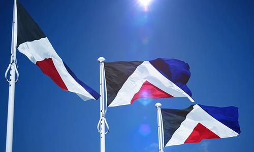
The two Kyle Lockwood-designed flags have topped the first round of the national flag referendum. No, that's not strong enough. Between the pair of them – and they they are really just slightly different versions of the same idea – they have crushed the three other contenders. The result is no suprise, although its thunderous nature might be at the edge of expectations.
I loathe both flags. They speak of muddling and mediocrity. They're not designs, they're clip art. They say nothing of a new New Zealand. They're an indictment of the market research that passed for consultation in the flag panel process. If anything, I've come to despise them more as the process has ground on. I will not be able to vote for a change to either Tweedledum or Tweedledee when the second round of the referendum is held next year.
This is not to say I have any great attachment to the current flag. I've been amused at the way some people I know have suddenly discovered in themselves a passionate loyalty to it, but for me will feel odd, even wrong, to vote for it next year.
Helpfully, opinion pieces like Tony Wall's Sunday Star Times editorial Don't be childish, let's get in behind the new flag will strengthen my resolve. Wall writes:
For me, the look of the flag is secondary to change itself.
Getting rid of the Union Jack is the most important thing, and we could argue until the cows come home about what should replace it. Now the people have spoken, change supporters need to get behind the winner.
It would be tragedy if Red Peakers - very vocal on social media but in reality a tiny minority – had a fit of pique (ba boom!) and refused to vote in the second referendum in March. They should swallow their pride, accept their choice just wasn't that popular, and vote fern and stars.
It's rather a depressing argument: that no matter what we think or why we think it, we should just buckle under and shuffle along with the crowd. As an assertion of national identity, it might be a bit too telling.
Wall concludes by noting that his colleague Rob Stock gave his flag decision to his daughter, "arguing she will have to live with it for longer than him," and she immediately chose the red Lockwood. So, as it happens did my older son. His younger brother, also of voting age, took a different view – immediately dismissing all the fern designs as "too hard to draw" and opting for the koru first and Red Peak second. (Reminder: not all autistic people are the same.)
Clearly, I'm capable of holding a view without thinking that anyone who doesn't share it is a terrible person.
Readers, I voted for Red Peak. This doesn't make me some sort of social media ninny or lefty naysayer. I was attracted by the boldness and simplicity and by the fact that, alone amongst the five finalists, it holds closely to the principles of good flag design. But it's more than that. Over time, Red Peak has drawn substance from the way people have thought and talked about it. If there's little to be said about the Lockwood flags – everything is there on the surface – Red Peak has deepened the longer it's been around.
It helps that its basic design integrity lends itself to adaptation. After the referendum result was released, the official First to the Light Twitter account posted this immediately recognisable image.
Thanks for your support! #redpeak pic.twitter.com/AC6gP2QlQC
— First to the Light (@firsttothelight) December 4, 2015
There have been many, many other iterations:
#redpeak #nzflag What other flag design has inspired many people to make their own versions? That's real ownership. pic.twitter.com/YMkWL02Bhj
— Arteis (@Roly_NZ) December 10, 2015
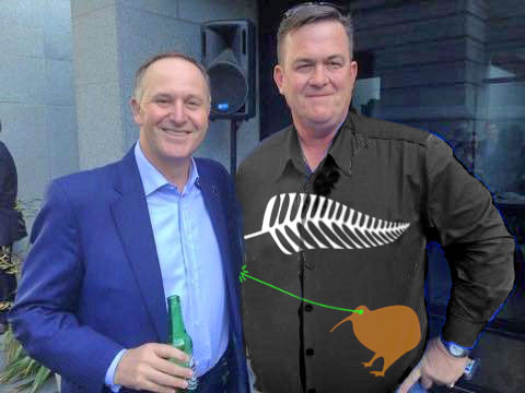
This website captures dozens more instances and invocations of Red Peak, submitted by members of the public. This hasn't happened with the Lockwood flags. Indeed, in many cases, it couldn't happen. The design, such as it is, would collapse under interpretation or simply be impossibly ugly. If you need an example of this, look at the Lockwood-inspired shirt Sean Plunket insisted on wearing in public during the voting period.
Others recently found a parallel between the new Lightpath cycleway in Auckland and the Red Peak flag that looks over it from a building on Karangahape Road.
Riding #Lightpath under #RedPeak is visiting a future where bikes rule & NZ haz a cool flag https://t.co/7txz3UmVBw pic.twitter.com/h8BetVDwje
— Matt Bostwick (@mattbostwick) December 3, 2015
#Redpeak from #LightpathAKL - a new New Zealand. pic.twitter.com/X9X97Qg1e8
— Richard Easther (@REasther) December 3, 2015
The idea of a "new New Zealand" might seem vague, but it's not convetionally political. Both designer Red Peak's Aaron Dustin (who works for Xero) and its accidental champion Rowan Simpson (a foundation employee and/or investor in Trade Me, Xero and Vend) are in the business of new ideas. They're identified with a broader creative sector which has become implicitly associated with the design.
There is also a historical dimension, one outside the official narrative of wars and All Blacks. Public Address has been proud to have published several posts highlighting the work of Peter Alsop in rediscovering and celebrating a remarkable design heritage – most recently, this one previewing Peter's new book about Marcus King, who straddled the worlds of fine art, craft and commerce in what I think is a characteristically New Zealand way.
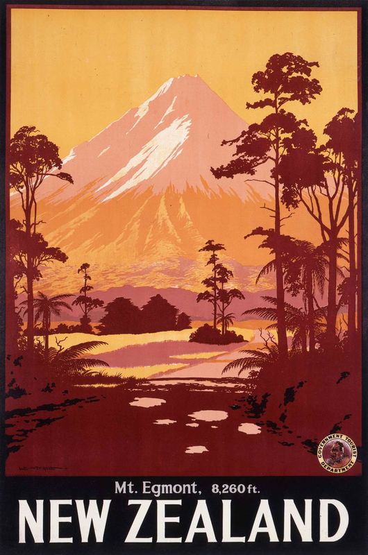
Still earlier, while the gods of the New Zealand canon were grappling with the idea of a distinct national identity, the likes of Leonard Mitchell were creating strong, confident poster art for the Government Tourist Department:
Then there's Colin Simon's brilliant logo for the 1974 Commonwealth Games in Christchurch, which Dustin consciously referenced in Red Peak:
As Lindsay Yee demonstrates in an appreciation of Simon's logo, the other imagery around the 74 Games was was strong too. It was a short, confident era; an interlude before the oppressive conservatism of the Muldoon years.
All of these works are art with a job to do. New Zealanders operate well at the intersection of creativity and practicality and I think that's where Red Peak sits.
So Red Peak stands for something. Should what that something is be nailed down, made more explicit? I briefly discussed this with Aaron Dustin on Twitter and he thought not. I think he's right: the design has prospered just as much from what people have brought to it as what they have taken from it.
And what now? We really might as well capitalise on what has been gathered already. So it doesn't matter if the flag doesn't change, or even if the public mood shifts and a Lockwood flag is annointed in the second round (we already have a terrible anthem – it doesn't define us). We can just, as individuals, use Red Peak.
The extent to which we can do that will be determined by its creator, who will presumably seek the return of his full copyright, which the referendum rules allow him to do. He already allows unlimited personal use of the design and it may make sense to retain some control of its commercial use.
But the bottom line is this. Red Peak is here. It has developed a significant, if generally implicit, meaning to many people and nothing says we must walk away from that. Indeed, sales of the flag have reportedly jumped since Friday night's result. We can, and should, just start using Red Peak if we want to.
Me? I've asked for one for Christmas.