This is why we can’t have nice things. I mean, I go away for a week (to Brunei, story about that coming up) and leave the voting on the uniform bracket open for a lot longer than I expected to and then I come back to this…
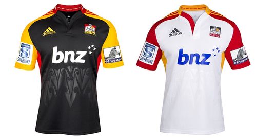
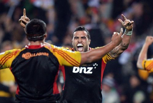
In the match-up between the Chiefs and the Crusaders, the glorious red and black simple uniforms of Canterbury lost to the orange, black and gold of the Chiefs 56%-44%. As much as I love my Chiefs, their uniform does look like it’s sponsored by McDonald’s.
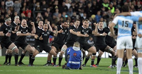
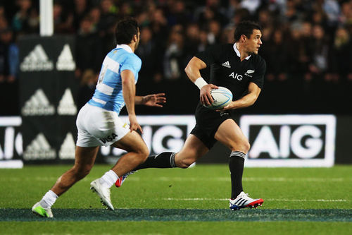
Meantime over in the international jersey competition, New Zealand’s black jersey with three white letters on the chest (that aren’t “NZL”) took on the beautiful royal blue throw back French uniforms. New Zealand won that one 58%-42%.
Sigh. I knew that my two favourites (France, Stormers) wouldn’t make it; I just wasn’t sure how betrayal would taste.
In all seriousness though, I think it says a lot about the various jersey makers and designers that our top four were all adidas strips and that Nike, Reebok and Kooga have a long way to go in terms of rugby uniform design. Canterbury is ok, but what is with all the piping?
In the international jerseys big broad strokes of colour (France, NZ, South Africa, England) always seem to fair better than bitsy “clever” designs (US, Scotland, Australia) and it’s similar at the franchise level where the solid colours of NZ teams won out over the odd colour combos from South Africa. Also no one likes Australia, sorry Australia.
So what are our two finalists like?
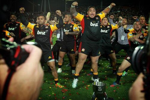
Chiefs: All black front chest panel, yellow sleeve panels with red trim, collar and under-arm panels. Names of the feeder provinces listed around the collar, and embossed Maori design around the midriff.
The red and yellow seem brighter than the Waikato ITM cup jersey, though that might just be because of the orientation. There is a giant BNZ ad on the front but it’s plain white and it’s hard to knock a franchise for having advertising.
The away strip simply replaces the black with white swaps the black for white and swaps the red and yellow around (adding red to the inside of the "cleavage" too). The adidas and Chiefs logo are changed a little too however the BNZ logo suddenly becomes blue which makes no goddamn sense whatsoever. The away strip also looks a lot more like the players are working the grill at Maccas.
New Zealand: All black… because y’know. Ok, maybe not all black, there is that white collar. On the inside of the collar are the words “World Champions” along with 1987 and 2011. There are no seams, the jersey is a tube. The All Blacks are a series of tubes (this is a joke I am recycling).
I’m sure we’re all aware of my thoughts on the “AIG” that sits on the front. As sponsors logos go, it’s fairly inoffensive, the idea of having a logo on the front is far more so. I know we used to have worse sponsors logos but for some reason you lose some of your mythos once you add a corporation to your shirt. The only hope we have is that the alternate white strip keeps the AIG in white too.