The data for the 2014 New Zealand Election Survey was recently released for the general public to make of it what they will, which in the modern world of home data analysis is like parachuting a gazelle into a pride of lions.
One thing I decided to explore is how representative the ideas of "Left" and "Right" are in the New Zealand of today. They are terms that get bandied around, and people and parties get pinned into place with, but do they actually matter?
One of the questions in the survey asks people to rate themselves on a spectrum of Leftmost (0) to Rightmost (10) with 5 being the centre of the spectrum. We can join that tidbit of information to information about what political party did the person declare voting for with their party vote, and so check the self-identified Left-Rightness by party preference.
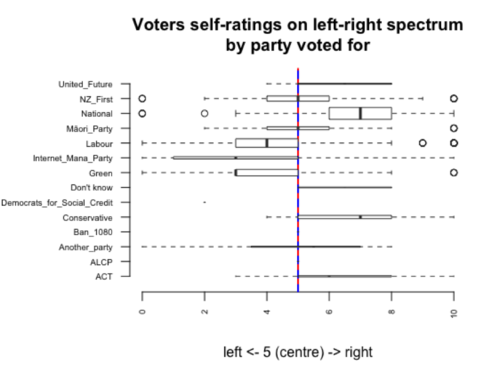
For those not used to box plots the rectangle is where the middle fifty percent of voters for the party rate themselves. The black line in the centre of each rectangle is the median voter. The red-blue dashed line is the "centre" of the spectrum. The vertical thickness of the rectangle is the number of votes.
The smaller the number of voters (the thinner the rectangle) the more the results become sensitive to what one or two voters chose on the eleven-point scale. So, for this post, I am making the arbitrary decision to not bother talking about the parties with less than 0.5% of the vote in the survey responses (that is 14 people in the survey). Bye-bye for now to United Future, ACT, ALCP, and similar.
There are some not too surprising things on view here: not many people view themselves as extreme, people who vote Labour tend to see themselves on the left, people who vote National tend to see themselves on the right. New Zealand First and Māori Party voters see themselves as the generally most centrist. I do want to draw attention to the way that Labour voters tend to see themselves as closer to the middle than National voters.
We can build on this by comparing what people think of themselves with what people think of the party they voted for.
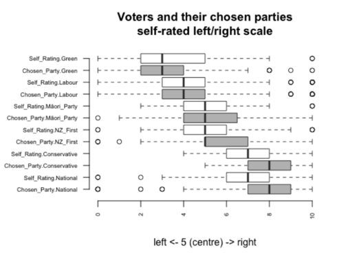
I dropped Internet/Mana for this graph, as I had separate ratings for Internet and Mana and that just made it complicated. The Green party, while having the same median as its voters, is given support by those that consider it to the left of their positions. Labour has an almost freakish match between its voters' self-perceptions and the perception of the party (I actually went and checked for mistakes due to that. Didn't find any). Māori party voters see themselves as slightly more centrist than the party. New Zealand First, while having the same median as its voters, draws support is given support by those that consider it to the right of their positions. Both National and Conservative voters tend to view the party as being to the right of the voters.
Rather than looking at it as bar graph summaries, we can look at the cloud of individual points of the self-rating on the x axis and the voters rating of the party they voted for on the y axis.
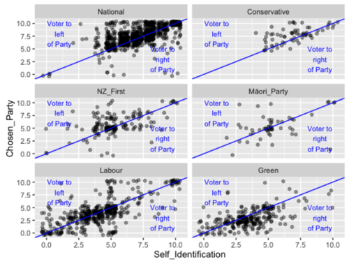
Putting aside the few isolated very odd results that may indicate people may have misunderstood the question, there are a number of observations about general patterns.
Conservative voters mirror National voters. Conservative and National voters tend to be centre to right, and see the parties they are voting for as more rightwing.
New Zealand First voters cluster at the centre and spread to the right, while the centrist NZF voters see the party as to the right, the right NZF voters see the party as to the left.
Māori Party voters and party form a central clump, with a tendency to rate the party near to themselves (most of the points are near the diagonal).
Labour voters are spread through the spectrum and concentrated in the centre left. Whatever Labour voters think of themselves tends to be around what they think of the party – if you are left and vote Labour then you describe Labour left, if you are right and vote Labour then you describe Labour as right. Green voters tend to centre to left, while rating the party left of where they are.
This does raise the (to me) interesting point that some people are voting a party they see as long way from themselves on a left-right spectrum. So how relevant are traditional left/right models in MMP New Zealand- clearly people understand them and can place themselves and parties- but to what extent does this actually matter in voting behaviour.
We can check this by rearranging the data a bit, and asking the question "What percentage of each parties voters voted for the party that they rated closest to them on the left/right spectrum?". The core idea here is that if you are skipping over a party that it is most in your "class interest" to vote for, then that suggests class interests are not your motivating factor.
Before revealing the results I'm going to preemptively say this is not an either/or- you might still be voting for a nearby party in left/right terms, just not the most nearby party or parties. But as you are not voting for the party that is, by your own opinion, the closest fit in left right terms so there is presumably other motivations at work.
I am bringing back ACT and United Future for this, as we have ratings for them, but still need to exclude Internet/Mana because of the whole ratings for both Internet and Mana confusing matters. So, the percentage of each party's voters that rated the party they voted for as closest to them (of the voters that rated all of the parties in the group, and answered the questions who they voted for, their self-rating, and the party best to deal with the most important issue in the country):
|
Party |
% of voters closest |
Sample size |
|
National |
74.26 |
571 |
|
ACT |
66.67 |
3 |
|
Māori_Party |
66.67 |
33 |
|
Labour |
56.77 |
266 |
|
NZ_First |
56.57 |
99 |
|
Green |
56.11 |
180 |
|
Conservative |
52.08 |
48 |
|
United_Future |
0.00 |
4 |
There are some pretty big differences there (putting aside the handful of United Future zealots who voted from far along the spectrum). The concept of Left vs Right seems most important to National voters, then less important as you move left.
However, these results are strongly affected by how people space out the rating of parties. If you rate the Greens 3, Labour 4, and New Zealand First a 5, then to be closest to Labour you must rate yourself a 4 to be closest to the party. But if you rate National, the Conservatives, and ACT as 7 and New Zealand First as 5, any self-rating of 6 or better puts you closest to National (and ACT and the Conservatives). So these particular results, while interesting, shouldn't be read as too exact.
The party closeness can also be read in relation to the question that boils down to "what is the party you think is best suited to dealing with the most important issue facing New Zealand". We can consider if this was the party the person actually voted for (this is why I was including this question when making the previous graph).
|
Party |
% voters think best |
Sample size |
|
National |
88.44 |
571 |
|
Labour |
61.28 |
266 |
|
Green |
60.00 |
180 |
|
NZ_First |
39.39 |
99 |
|
ACT |
33.33 |
3 |
|
Conservative |
22.92 |
48 |
|
Māori_Party |
12.12 |
33 |
|
United_Future |
0.00 |
4 |
The ability to deal with the most important issue seems to be broadly in line with party size (putting aside those with a handful of voters giving overemphasised weight to their opinions) and thus being able to have policies on stuff. But it is also broadly in line with electoral success (which is, after all, tied very much to party size).
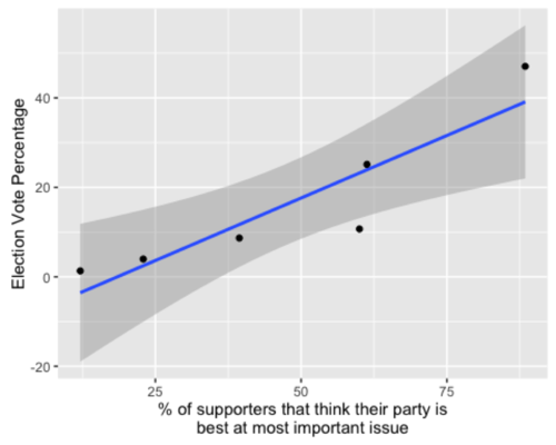
If you look at both the left right spectrum and the best at dealing with issues in combination, if you explain people's behaviour with the left-right spectrum, then you also need to use best for issues, but If you use best for issues, that explains everything the left right spectrum does and more. So a minimalist explanation only needs to pay attention to issues.
Finally rather than comparing closeness and best party for the key issue as completely unrelated, we can work out for each party how many voters for the party were both closest and thought the party was best to deal with the key issue, how many were closest and thought it not best on issues, how many were not close and thought it best on issues, and how many were neither close to the party nor thought it best to deal with the key issue.
Of these final divisions the bestClose group who both see their chosen party as closest to them in left/right terms and feel that the party is best at dealing with the most important issue, I would imagine these people were very comfortable with their choice:
|
metric |
Party_Vote |
percent |
|
bestClose |
ACT |
33.33 |
|
bestClose |
Conservative |
14.58 |
|
bestClose |
Green |
37.78 |
|
bestClose |
Labour |
36.09 |
|
bestClose |
Māori_Party |
6.06 |
|
bestClose |
National |
66.90 |
|
bestClose |
NZ_First |
26.26 |
|
bestClose |
United_Future |
0.00 |
The bestNotClose voters have reached across closer parties to vote for the party best able to deal with the most important issue, I'm thinking of these as issue voters:
|
metric |
Party_Vote |
percent |
|
bestNotClose |
ACT |
0.00 |
|
bestNotClose |
Conservative |
8.33 |
|
bestNotClose |
Green |
22.22 |
|
bestNotClose |
Labour |
25.19 |
|
bestNotClose |
Māori_Party |
6.06 |
|
bestNotClose |
National |
21.54 |
|
bestNotClose |
NZ_First |
13.13 |
|
bestNotClose |
United_Future |
0.00 |
The closeNotBest voted for a party they see as close to them but this was not a party they thought best at dealing with a particular issue, I'm going to imagine these as being the voters of class interest.
|
metric |
Party_Vote |
percent |
|
closeNotBest |
ACT |
33.33 |
|
closeNotBest |
Conservative |
37.50 |
|
closeNotBest |
Green |
18.33 |
|
closeNotBest |
Labour |
20.68 |
|
closeNotBest |
Māori_Party |
60.61 |
|
closeNotBest |
National |
7.36 |
|
closeNotBest |
NZ_First |
30.30 |
|
closeNotBest |
United_Future |
0.00 |
The notBestNotClose group are giving their support to a party not closest to them which they do not think is best at dealing with the most important issue, these are people whose voting reasons are not well represented by these questions.
|
metric |
Party_Vote |
percent |
|
notBestNotClose |
ACT |
33.33 |
|
notBestNotClose |
Conservative |
39.58 |
|
notBestNotClose |
Green |
21.67 |
|
notBestNotClose |
Labour |
18.05 |
|
notBestNotClose |
Māori_Party |
27.27 |
|
notBestNotClose |
National |
4.20 |
|
notBestNotClose |
NZ_First |
30.30 |
|
notBestNotClose |
United_Future |
100.00 |
One possible reason is that these are representation voters- that people are voting to have the party in parliament even though the party does not specifically align to them or is the best to deal with issues. If that is the case, I think it is kind of heartening for democracy in a multiparty system.
I have moved the processing code (in R) into another document so that those that want to check the technical steps can do so.