The Super Rugby season is wrapping up after six long months including breaks for the international test window and the Lions Tour and we hope to get some respite from Steve “where’s my close up?” Walsh. When the final whistle blows in Hamilton we’ll start up the second round of test matches, both at “home” (Investec Rugby Tournament) and away (the end of year northern tour). We may even have some time for a provincial rugby tournament of some sort.
So now seems a perfect time to do an in depth analysis of uniforms. (Some of you may be asking why, as a Chiefs supporter, I’m not writing about the upcoming SHUT UP SHUT UP YOU’LL JINX IT!)
Those who’ve been reading this blog for a while know that I’ve got a “thing” for sports uniforms. I’m a believer in both innovation and tradition. So for example the French ombré uniforms that Nike put out for the last World Cup were innovative in their deign but railed against the tradition of France wearing the same blue that is on their flag. Meanwhile the South Africans have a very traditional uniform that borders on boring.
I began to wonder, after watching New Zealand play France this year, if my opinions had shifted. I mean, it used to be that New Zealand had the best uniforms in rugby, full stop. There just wasn’t a better uniform out there… and three little letters took that away.
And so here it is, my new breakdown of the best uniforms in rugby (for the purposes of this, I have taken rugby to mean only Super Rugby and the best international teams).
Super Rugby:
15: Reds – Are you kidding me? How much junk do you want to put on your uniform including a great big white square on your stomach? Also, notable for being the only red uniform that isn’t a “proper” red.
14: Sharks – I don’t mind Mr Price, but I bloody hate those collars and the diagonal “Reebok”.
13: Force – Never been good
12: Rebels – A uniform with a built-in starry tie
11: Waratahs – A least try to be a little bit different from the rugby league team
10: Brumbies – This is an anniversary strip for ACT’s centenary. Not great but not the worst either
9: Kings – Pretty high ranking for a boring uni, but this is their first year and I like that it’s not black but grey.
8: Bulls – I assume this was designed to be dazzle camouflage
7: Chiefs – The worst of the kiwi teams and I say that as a fan
6: Hurricanes – Solid yellow, pretty good but doesn’t look as good as solid blue or red
5: Cheetahs – The only team to play at home in white (because nobody counts what the Brumbies wear as “white”) and the aqua and orange remind me of the 1970s Miami Dolphins.
4: Highlanders – Two reasons why these guys are so high on the list. 1. A green away jersey. 2. All the rest of the NZ teams have the names of their feeder provinces inside the collar, the Highlanders have them written on the chest.
3: Blues – Used to have the best uni, but the embossed Rangitoto looks way too naff.
2: Crusaders – It’s just such a pretty red!
1: Stormers – Bands. It’s as simple as that. Blue bands with a white background and the sponsor’s logo incorporated into the design not just slapped on. Bloody well done by adidas there.
International Rugby
15: Scotland – This jersey has to be taking the piss. It looks like a 1990s X-Men costume.
14: USA – Stripes with no stars and just a bunch of awful
13: Argentina – Seriously, WTF? Argentina used to have an awesome uniform now… this? It looks like a Duran Duran album cover.
12: Ireland – I do not understand why this uniform has sticky boob panels.
11: Samoa – I get that you want traditional art on your uniforms, but moderation, please.
10: Japan – Pretty basic, nothing flash, but nothing to hate either.
9: Wales – Given they wear just red and white (with a hint of green) they sure do tinker with their uni a lot.
8: South Africa – Yawn
7: Australia – This is far from the worst jersey they have worn. That little green swooshy thing annoys me though.
6: Fiji – I like this traditional design in an arch.
5: Tonga - like Wales (and millions of other teams) wear red and white, but a smaller budget means they tinker less and so get a nicer uniform out of it.
4: Italy – I’m as surprised as you are, but I just like this simple uni. Much better than the old Kappa unis
3: England – White and just white. Also the Canterbury logo is red which is nice. Oh and Canterbury! No more colour-changing Nike!
2: New Zealand – A, I, and G. those three letters have ruined what was once the best uniform in rugby and one of the best in the world.
1: France – Sacre Bleus! But those stripes along the shoulders and the proper blue and the white collar! Oh my!
But I could be wrong!
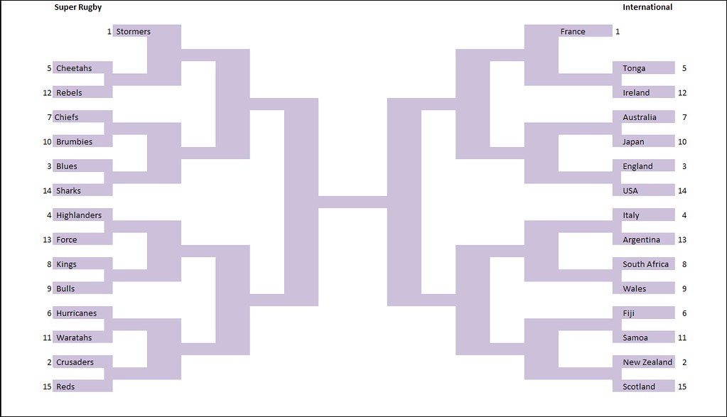
There is a very small percentage chance that I’m wrong. In order to test this hypothesis I have constructed, in the great American tradition, a tournament bracket!
The teams have been added based on the ranks I gave them above and added to the bracket accordingly. If my seeding was correct then both #1 seeds (France and the Stormers would meet in the final).
Below you will see the bracket and a form. Over the next five weeks I’ll update both as you vote on which uniform should go through based on the head-to-head match-ups. And if you chuck in your PAS name I'll draw one of you at the end to win a prize (currently 2 kilos of Eden Coffee beans! I figure five weeks should be long enough for me to rustle up some more prizes).
So get to it! Do South Africa look better than Wales? Is the lightning pattern on the Bulls really that bad? It’s up to you.