Polity by Rob Salmond

61

Hekia's waynebrave

The Education Minister, Hekia Parata has form on having stupid ideas in public. Up to now, the most famous one was her idea that the public would love larger class sizes in schools. Turns out they didn’t, because they prefer their kid to, you know, get more attention from the teacher rather than less. That waynebrave got yanked in less than a month.

Well, she’s outdone herself this week. Hekia’s new idea of massively expanding online-only primary schooling just reeks of small-minded, bureaucratic penny-pinching, right down to the naff name for the new sCOOLs. She might as well have said: "I call app Kiwis."

Yes, it’s true that some people get their basic, compulsory education online already. They do. And some of them do just fine out of it. That’s true, too.

But the only reason they’re doing online education, sometimes with phone and visit support from the folk at the Correspondence School, is because they physically can’t get to a local in-person school. If you grow up on a remote sheep station, their school might be an hour away, each direction. That’s obviously not practical, which is where the Correspondence School comes in.

Online schooling is a product of necessity, not choice.

And there’s a very good reason for that – in an in-person school, students learn at least as much from other students as they do from the teachers. Both inside the classroom and in the playground, kids at a traditional school learn about meeting new people, friendship, sharing, scheming, new skills, winning, losing, and so much more besides.

Is the Minister really saying there’s an app or online module that substitutes for those experiences, or that can properly teach all those social skills?

Of course there isn’t.

Proponents of oddball ideas like this often appeal to choice – if the parents want this for their kids, who is anyone else to say otherwise?

But the puritan mantra of choice uber alles has never applied to schooling, just as it doesn’t apply to sending a kid down the mines or all other crazy things some parents might want for their offspring.

Every advanced economy makes schooling compulsory because they agree kids should learn stuff, regardless of their parents’ wishes.

At those schools, we make certain subjects compulsory because as a community we agree kids should be able to do maths and to write, no matter the abilities of desires of their parents.

And, for the same reason, I’d say the community agrees that kids should learn social skills as well as academic skills in their schooling, even if their parents would rather they didn’t. Yes, there are very narrow exceptions. But social skills matter for kids.

I predict this latest Hekia Parata waynebrave will be never come to pass. And that’s a good thing.

32

Why did the TPP fail?

Hilary Clinton has joined Donald Trump in vowing to oppose TPP. US House Speaker Paul Ryan has also conceded he wouldn’t have the votes to pass TPP in a Lame Duck congressional session, effectively sinking Obama’s last chance to pass it before leaving office.

That all means the TPP is functionally dead. Without US ratification, the agreement can’t come into force.

So, why did it die?

There’s a theory of political institutions called Veto Players that can help explain this. Start with two basic ideas:

  • Each big country, or group of small countries, has a veto over the final agreement. And the US functionally has two veto players – the President and Congress – because of its treaty ratification rules.
  • Countries veto agreements that drive the world further away from their desired outcome.

With those basics in mind, we can build a little model of TPP.

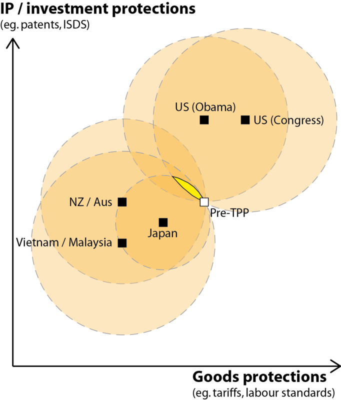
Let’s simplify the issues under negotiation to two core dimensions, and start building a chart:

  1. How much protection is there for local markets in goods, via tariffs, minimum labour standards, and so on. This is “Goods protection” in the chart
  2. How much protection is there for investors and exporters going into overseas markets, via patents / copyrights / ISDS rules, and the like. This is “IP / investment protection” in the chart.

The TPP clearly dropped some goods protections, as you see illustrated above. Im my read it also increased IP / investment protections overall, because the investor-friendly ISDS and copyright changes outweighed the consumer-friendly changes to drug patents.

But how does that eventual proposal square up with what the countries involved in the TPP negotiations actually wanted?

We can hazard some guesses at countries’ ideal points, too, based on their public statements and their history. Let’s just think about a few of the core players:

  • The Obama administration’s main concern was extending IP and investor protections for large American firms. They were less worried about goods protection, one way of the other.
  • The US Congress was more seized with “protecting American jobs” from the effects of the last decade or more of outsourcing. That means, in their ideal world, **more** protection of American domestic goods manufacturers, to prevent a recurrence of the US job losses that followed NAFTA, as well as protecting US investors offshore.

(Yes, this assessment runs counter to the Congressional rhetoric on free trade. But American hypocrisy on trade matters is nothing new.)

  • Japan wanted some tariff reductions to allow its goods into the US, but not wholesale tariff reductions that exposed their agriculture sector to too much forwign competition. They also seemed lukewarm on which way to go on IP protections.
  • New Zealand, Australia, and some others can go one way or the other on IP / investor rights – trading off better biologic access against allowing ISDS, for example – so long as there were big cuts in goods tariffs.
  • Vietnam, Malaysia, and some other developing economies also want the tariff reductions to allow better access to big markets, but they’re more opposed to the IP / ISDS elements of the deal, fearing they’d lose some of the ability to legislate in the public interest.


These preferred outcomes are included in the second chart above. The precise placement of the dots isn’t super-important, what matters is there’s a real diversity of opinion.

In this situation, with lots of veto players and diverse national policy goals, there’s often very limited room to find an agreement that makes nobody wore off.

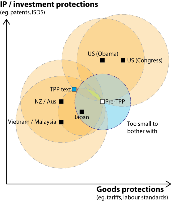
In fact, we can illustrate how little room there is by drawing some “indifference circles.” The middle of each of these circles is country’s preferred outcome, because that ideal point is what you’re trying to get closer to. The edge of every country’s circle passes through the status quo, because that status quo is what we’re measuring improvement – from each country’s unique perspective – against.

On the chart, orange represents improvement for one country, and yellow is the part of the chart where everyone is better off.

 As we’d suspect, the yellow sliver is tiny and represents modest policy change from what we already have. The TPP would have to be in this yellow sliver to get each player to sign it off on policy grounds.

But there’s a wrinkle here – the trade negotiators themselves don’t always share their country’s policy preferences. (It’s a version of a “principal – agent problem”.)

In this case the trade negotiation folk had an extra consideration. They had pinned their hopes on TPP to be a major breakthrough in the stalling progress of global free trade.  That means the deal had to “make a splash,” “be big and bold,” “be a game-changer,” or similar.

We can show that on the chart with a final circle, showing TPP policy-mixes that too close to the status quo to be worth the risks and costs of bothering with, from the trade negotiatiors’ position.

The uncomfortable reality of this situation was that the players could have either an agreement where everyone was actually better off, or it could have a deal that looked big and grand, but not both. They chose an agreement that looked big and grand, probably knowing they’d have an uphill battle with the US population and politicians, with the unhappy result that all their work ultimately has come to naught.

17

Hidden Costs

I read a poignant article yesterday. It’s about doctoral degrees and mental illness: 

The days I spent pursuing my PhD in physics were some of my darkest. It wasn’t the intellectual challenges or the workload that brought me down; it was my deteriorating mental health. I felt unsupported, isolated and adrift in uncertainty. Anxiety attacks became a part of my daily life. I drank and cut myself. I sometimes thought I wanted to die.

I might not have felt so alone had I known how many people struggle with mental health issues in academia. A 2015 study at the University of California Berkeley found that 47% of graduate students suffer from depression, following a previous 2005 study that showed 10% had contemplated suicide. A 2003 Australian study found that that the rate of mental illness in academic staff was three to four times higher than in the general population, according to a New Scientist article.

The broad point feels familiar to me, if not the details. Writing a PhD dissertation is very often a lonely, dispiriting endeavor. The loneliness is self-explanatory, I think. But the dispiriting nature of a PhD may be less clear.

Most PhD students get socialized, over several years in their training, into thinking the only acceptable career path post-degree is to do research and teach at a University, preferably a really fancy one like a Harvard or an Oxford.

But by this standard there’s about ten PhD students for each vaguely “acceptable” job, depending on the discipline. That means 90% of people graduating with the highest degree in the pyramid of degrees comes out feeling like a failure. Probably it’s even higher than that, as the people who end up with a semi fancy job were almost always considered and rejected for a really fancy job, leading them to rue what might have been.

I certainly saw that in my on time studying and working at American universities. Depression and imposter syndrome were rife under the surface.

I was generally spared the depression, except for the two months where my friends were getting invited to job interview by fancy schools but I wasn’t. It was OK in the end, but for two months I basically stared at an email inbox that never had an email I wanted to see.   Worse, it was full of congratulatory emails going to my friends who’d accomplished this or that. Intellectually, I ground to a halt.

It was yet another occasion where I / we fall foul of Desiderata’s advice:

If you compare yourself with others, you may become vain or bitter, for always there will be greater and lesser persons than yourself.

For me, that episode was blessedly temporary, but I’ve seen depression wreak havoc on other young scholars, both those who look outwardly successful and those who outwardly appear to struggle. Watching that happen is tremendously sad, too.

There are, of course, lots of other endeavours that have the same dynamic – a lonely pursuit of a glittering prize that ultimately most fail to win.

Is that a recipe for depression for the athletes as well as the nerds? Or does the endorphin rush of physical exertion help keep the beast at bay?

I sure hope it's the latter.

11

The most important graph in the world

Here’s the chart that should be at the centre of every debate – in New Zealand and elsewhere – about trade and globalization:

It comes from the World Bank, and shows changes in income around the world from the fall of communism to 2008. It’s based on income surveys of around ten million households, and critically it lets us see how people at different points on the world income distribution have fared during globalization.

For me there are three things that stick out from this chart.


1. Globalization is really helping the developing world

The big sell on globalization was that it would lift the living standards of millions, even billions, of people in the developing world. Turns out that’s true.

The chart shows that really is happening, with the middle part of the world income distribution recording very high percentage gains in income since 1988. Each person in that group is only better off by a few hundred US dollars a year (PPP), but that money makes a massive, massive difference to their quality of life. 

2. Globalisation is really helping the world’s elite

The big knock against globalization was that is was a cash grab by the world’s elite, and the already wealthy would capture most of the gains. Turns out that’s also true.

The top 1% of the world’s income earners – with an average (PPP) income of around USD $65,000 in 2008 – pulled in over 60% income gains across the first twenty years of globalization. That’s almost as much as the top gainers in the developing world, but comes off the back of already very high incomes.

Once you do the maths on how many dollars each segment of the income distribution gained, you find that the world’s top 1% of income earners have captured 29% of all the worldwide income gains over the period, while the top 5% of income earners have captured 55% of all the gains.

Of course, the value of each dollar is very different for this group. Just as a little money goes a long way to improve the welfare of people in the developing world, even lots and lots of money doesn’t make an enormous difference to the living standards of the elite. In terms of using globalization to improve human welfare, that’s highly wasteful.


3. An important group, likely including many New Zealanders, is missing out

While the developing world has mainly done well and the world’s elite have dove very well, too, those people between the 70th and 90th percentile of the global income distribution haven’t done nearly as well. Many of those people are lower income earners in richer countries, along with the middle classes from the former Warsaw-pact nations.

While incomes about and below them have soared by 60% or more, some in this group have seen their incomes basically stagnate for twenty years.

Empirically, the pattern is obvious.

Politically, it was never part of globalisation’s sales pitch.

Ideologically, it is very troubling.

I completely get why it’s a good idea to embrace an economic system that helps the developing world escape extreme poverty. I support that part of globalization wholeheartedly.

But does that system necessarily have to deny the working poor in rich countries any meaningful gains, in order to deliver huge windfalls to the few percentiles even richer than them?

Given that pattern, it can’t be surprising when people from that cohort start to reject the pro-globalisation orthodoxy by supporting Brexit or Trump. They’re saying, with some justification: “why support a system that delivers more for everyone else that it delivers for me?”

* * *

It won’t surprise regular PA readers that I see a case here for more redistributive income and economic policy within the rich countries. The windfall gains to the richest of the rich are showing up as big increases in rich country inequality, and the people in those countries aren’t happy about it.

Indeed, the 2014 New Zealand Election Study shows a full 68% of New Zealanders support the government doing more to narrow the income gap, while only 17% oppose the idea. Even among National voters, narrowing the income gap attracts 50% support against only 29% opposition. Our public wants our government to act on rising inequality, and address the ugly pattern the World Bank’s chart is illustrating.

Taking the rough edge off globalization for the world’s upper middle class also protects the gains that billions in the developing world have felt from globalization. It’s insurance against the repugnant – a democratic revolt from above.

35

Australian election: Dust and Diesel

It looks like the curtain has finally come down on Australia’s cliffhanger election, with Malcolm Turnbull’s Liberal/National coalition hanging on by way of deals with several one-seat parties.

One underreported aspect of the results, though, is the bias in them.

That bias favours the right-wing parties, and occurs in basically all single-member-district electoral systems, including Australia’s Alternative Vote system and New Zealand’s old First Past the Post system.

The reason for the bias is that there tend to be tighter concentrations of lefties in inner city and low-income electorates, compared to the more even distribution of lefties and righties in the suburbs. That is: fewer right-leaning voters choose to live in places like Mangere, compared to the number of lefties who choose to live in places like Ilam.

As a result left-leaning parties tend – on average – to win their seats by a greater margin, compared to right-wing parties, meaning left parties win more votes per seat. That’s the bias.

There’s plenty of evidence in support of this bias in New Zealand history. Across the twenty elections we held under FPP from 1935-1993, Labour averaged 14,230 votes per parliamentary seat, whereas National averaged only 13,770 votes per seat. That difference, of almost 500 votes per seat, is the bias.

The place this bias shows up most obviously when the popular vote goes one way, but the election goes the other way. That’s what looks to have happened in Australia. This morning, Labor was ahead 50.1% to 49.9%, this afternoon, the coalition re-took the lead 50.3% to 49.7%. Whatever the final result comes out as, it will be incredibly close.

By rights, the seats should also be tie, yes?

But the seats aren’t really close at all. The Coalition is solidly ahead, looking to have 77 seats, while Labor has 68 and the remaining few are scattered among the smaller parties. 

This has happened before. In Australia, Labour has been on the wrong end of winning the popular vote but losing the election on five separate occasions – 1940, 1954, 1961, 1969, 1998. Only once has the reverse happened.

When New Zealand had FPP elections, the same thing happened twice, in 1978 and 1981. Both times it cost the Labour party and helped the National party. In the US it famously happened to Al Gore in 2000. It happened to Congressional Democrats in 2012. And so on.

This is one of those patterns that’s reasonably well known in the political science community, but almost entirely unknown outside it.

Jowei Chen, my former colleague at Michigan, and his coauthor Jonathan Rodden, showed this effect really convincingly in a lab environment, using a set of computer simulations. The computer drew lots of electorate boundaries in Florida, using non-partisan criteria of being contiguous and small. Then it used real vote data to run trial-heat elections using those boundaries. The result: The Republican seat share usually outperformed its vote share, while the Democrats suffered the flipside of that bias.

Should Australians be outraged that the seat split didn’t follow the vote split? 

If you win the popular vote in a democratic election, shouldn’t you normally expect to win the election as well, whether you're a leftie or a rightie? And if you tie the popular vote, shouldn;t you also tie the seat split?

Is there any good, democratic reason not to expect this?