Somehow I got entangled in a Twitter three-way between Hooton, Rob Hosking and #heyclint over youth unemployment figures today, and my 2 Degree 3G was crapping out on me again, so I was in the Twitter-equivalent of a vegetative state, watching them fight around me.
I haven't been following this, so I don't really know what HORRIBLE RIGHTWING LIES Hooton has been telling, but Rob brought out this graph which piqued my curiosity.
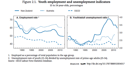
The chart on the right really does seem to show that youth unemployment - although well above OECD average - is going down. Does it?
Spoiler: No.
In the spirit of quickfisking, I'll just get to the point. Here is the unemployment rate for youth (the blue line) vs adults (the red line). Note that the 25-54 age group is the "prime" working age used by OECD for its youth/adult ratio.
First off: It's pretty hard to see the good news in this. I don't blame National for the GFC, but it's impossible to look at this and suggest that National has made a dent in the problem. Unemployment is as bad as it's been since the GFC hit.
So how does this gel with a decreasing youth/adult unemployment ratio? It's just simple arithmetics. Since its lowest point in 2007, adult unemployment went from 2.6% to 5.3% - a 104% increase. Youth unemployment went from 10% in 2007 to 17.3% - a mere 73% increase.
The upshot is that the youth/adult unemployment ratio is closing because adult unemployment has risen faster than youth unemployment, which hasn't fallen at all. It is nothing to gloat about.
Here is the data.