Anticipating the cries of "Shill!" I have to say: I like the new Super 14 uniforms. I also like the idea of having home and away strips.
It makes a fair bit of sense. American leagues have been doing it for over 100 years now (baseball has always has "home whites" and "road greys").
But to get the most information I rang Greig Bramwell of Adidas New Zealand to talk about the new uniforms (audio coming soon).
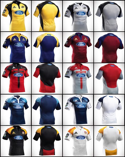
Beforehand I was sent high-res images of all the new jerseys to pour over (they're all in this Flickr set for your enjoyment). My first thought was that "these are actually pretty cool" and "I'm glad I'm a Chiefs supporter". The advertising is kept to a minimum (Ford front and back, Rebel Sport on the sleeves) and the colour schemes work well (no crazy ideas).
The most "outrageous" design might not be the Highlanders away strip (in Southland maroon) but the Crusaders away strip in "platinum" and red, and after twisting Greig's arm he conceded that it would be the one he would least like to wear. And while he's a Hawkes Bay man, the Blues away strip is the most stylish in his opinion. Personally I don't hate the grey and red (the sword's probably a bit much) but I really like the Chiefs away strip.
But why away jerseys now? Well, as Greig pointed out, the teams have had alternate jerseys for a while now and this is just the next continuation of where the NZRU, the franchises and Adidas want to go to with the uniform design. And that's an important point: the franchises and the NZRU wanted this.
And we know why they want to wear different strips, to look different from the other team. And the players like that. By having an official away jersey the players don't necessarily feel like they are being forced out of their usual colours.
So the teams sit down with the Adidas designers and look over concepts and designs and choose what they want and what colours they want. It's a long process too and many of these designs have been in the pipeline for many years.
Of course there is money involved. This is the first time consumers have been able to purchase the away jerseys. I asked Greig if he expected this to mean greater sales and he said that in an ideal world (for him) every fan would buy a new home and away jersey but he knows that naturally they're not gonna do that. Instead fans can now get to choose a colour. Don't look good in Hurricanes yellow? That's ok, buy the grey jersey.
But what will happen when the Highlanders go to Christchurch or the Hurricanes travel to the Sharks? Well this weekend there is a meeting with all the franchises where all the jerseys are laid out for each game and potential colour clashes are sorted then.
But to the nitty gritty of the jerseys. They are all created with ForMotion, which is Adidas' technique for creating clothing so that it can "enhance the natural motion of sport". So for example in rugby the arms are often held out from the body (especially if Sione Lauki's carrying the ball) so players need their jerseys to give them that freedom.
But surprisingly this still allowed for the jerseys to be constructed differently. Check out the difference at the shoulder on the Hurricanes jersey compared to the Crusaders, compared to the Highlanders. The backs all look like they have the same construction though (but I can't say I like the Chiefs "fanny panel").
The shorts (which I don't have pics of) were also constructed to be better for the players. They are cut so that they are longer on the inner leg than on the outer (rather than straight across like traditional shorts). This was again done because players find them easier to run in. Also the Blues will be the only to have the same shorts and socks for home and away as the team felt that their away strip might be too white.
This may shock some of you who are sticklers for tidiness. The jerseys are designed to be tight (making Richard Kahui fans happy) and that means they don't have to be tucked in. But they better bloody well have their socks pulled up!
Some of you might have noticed that some of the jerseys are embossed with a design. The Chiefs have a koru pattern, the Highlanders have a Celtic shield, and the Hurricanes have their swirly logo. This was an Adidas suggestion that was taken up by the teams. The Blues and the Crusaders also went for details, though theirs are more obvious.
I asked Greig which way the development of uniform technology went and he informed me that all the new and most high-tech stuff goes to the All Blacks and then filters down to the Super 14.
And because Grieg was on the line I couldn't let him get away without asking the most burning uniform question I had all year: were the numbers on the All Black jerseys bigger this year? Not only was I the only one pedantic enough to notice, but it was actually a new font, chosen for its visibility. It is something to note because the new Super 14 jerseys will be using the same font, replacing the hard to read font of last season. Sadly Greig didn't know the name of the new font but I am trying to find out from the NZRU and when I find out I'll tell you (because you're dying to know).
I also asked why there were no poppies on the All Black jerseys when they played Scotland before Armistice Day. The reason was the players decided against it. In fact all decisions like that are made by the players and the NZRU.
All in all we have very little to complain about in the uniform department, unlike these poor bastards.